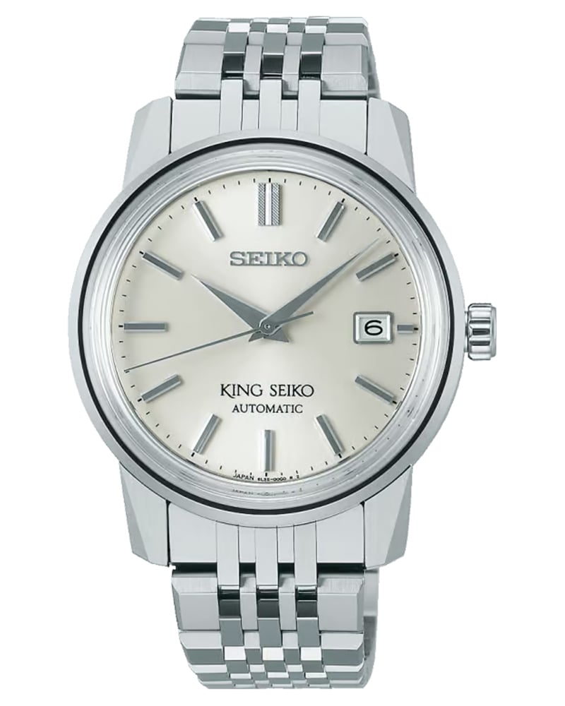
How Dial Finishing Changes the Way a Watch Reads
Spend enough time around watches and you begin to realise that colour is only half the story. Two dials can share the same shade of silver, blue or black and yet feel entirely different on the wrist. One might read crisp and immediate, the other warmer and almost atmospheric. The difference often comes down to finishing. Not complications or case size, but the way light meets the surface of the dial.
Historically, finishing wasn’t about aesthetics alone. Early dial textures emerged from necessity and technique—engine-turning to avoid glare, frosted metals to disguise imperfections, and lacquer to protect surfaces and enhance contrast. Over time, these functional choices became visual languages of their own. Guilloché came to suggest craft and formality. Sunray brushing aligned itself with modernity and precision. Matte finishes spoke the language of instruments and sport. Mother-of-pearl brought in an organic, almost jewellery-like sensibility that no two dials could ever replicate exactly.
Today, finishing is all about craft and industrial production. Some patterns are still cut by hand or closely supervised machines while others are stamped with remarkable consistency. Neither approach is inherently superior, but the difference is visible—to the eye, and to anyone who spends time with the watch. Finishing determines depth, shadow, contrast and the way indices and hands stand out—or don’t.
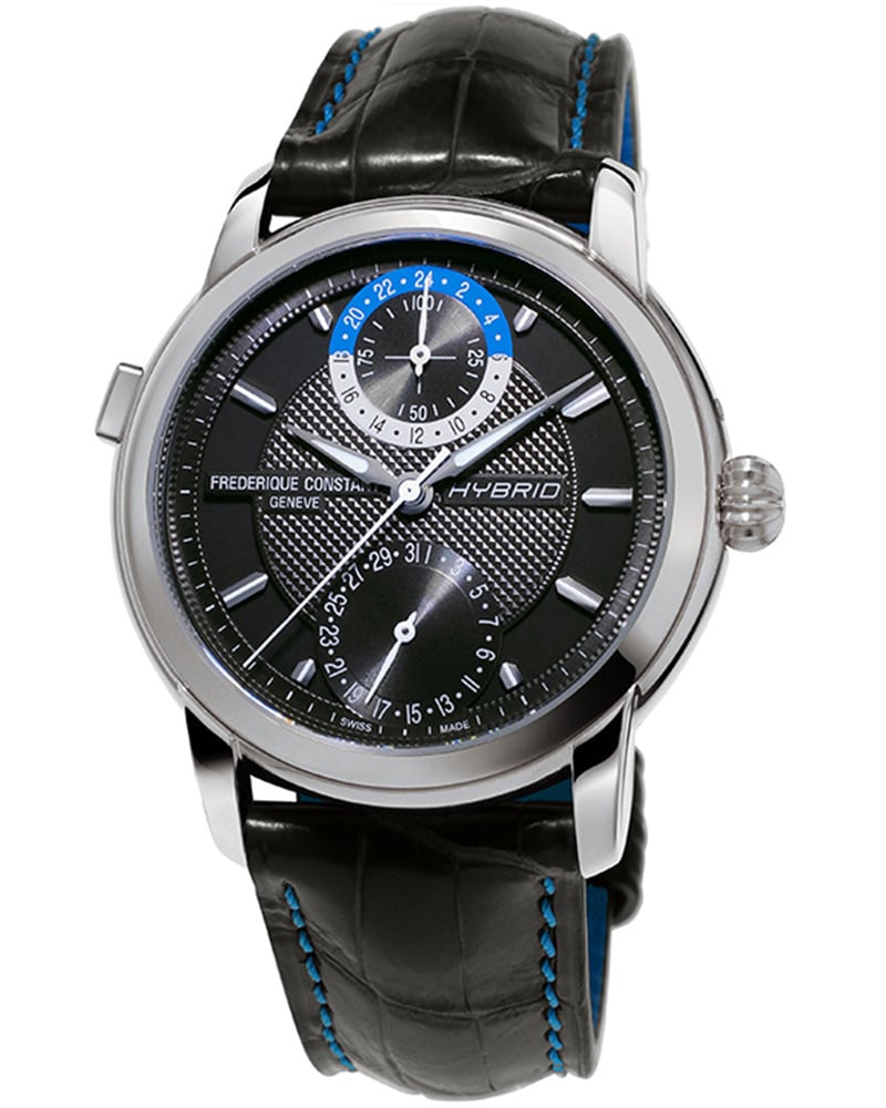
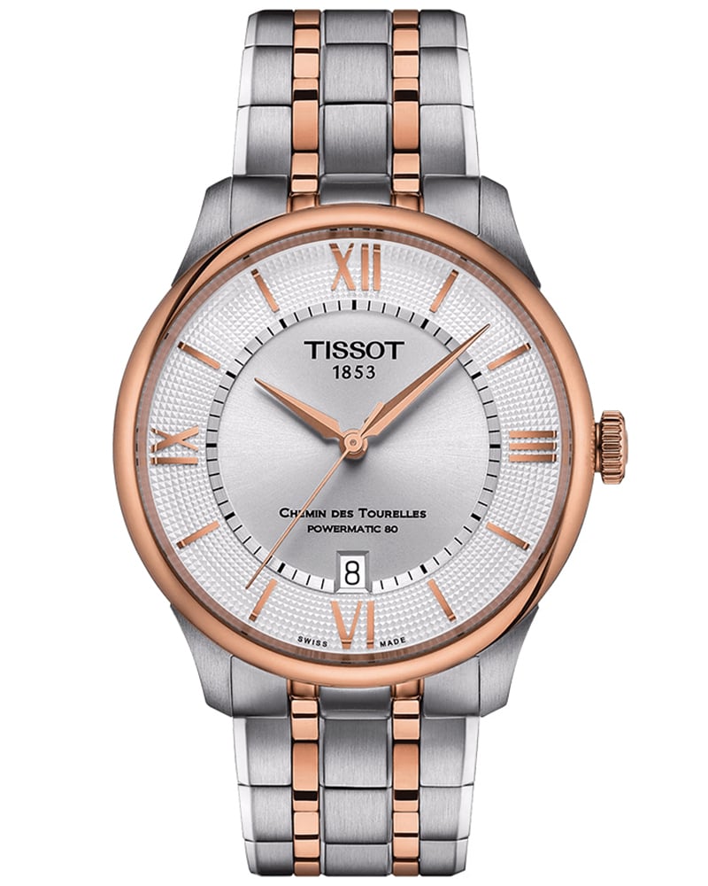
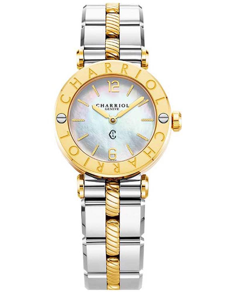
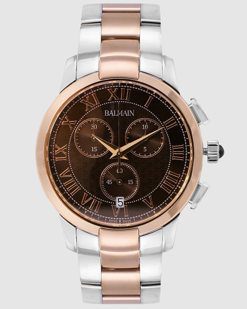
More than anything, dial finishing shapes how a watch behaves in the real world. Under bright sunlight, under office LEDs, at dusk, or across a dinner table. It’s why some watches feel endlessly engaging, while others reveal everything at first glance and then little more. What follows is a closer look at the key types of dial finishing, why they matter and how five contemporary watches use texture to define their identity.