How Indices Can Make or Break a Dial

How Indices Can Make or Break a Dial

Watch enthusiasts often fawn over movements and complications, and rightfully so. Yet the part of a watch we look at most, the dial, often escapes the same degree of scrutiny. Look closely, however, and you’ll find that its indices tell a parallel history of timekeeping itself. Before mass production and quartz accuracy flattened design into a familiar cadence, numerals were shaped by the tools of their era: the engraving burin, the enamel kiln, the limitations of early printing presses, and even the cultural preferences of the societies that wore them. 

In early portable timekeepers, Roman numerals dominated not because they were quaint, but because they were familiar to the educated classes who commissioned and owned such pieces. Their upright, serifed structures echoed the typography of the first printed books and (even earlier) the carved inscriptions of civic buildings. As pocket watches became more widespread through the 18th and 19th centuries, numerals evolved in response to the tasks timepieces were assigned. For the gentry, watches were symbolic and decorative, so ornate scripts and curved numerals were common. For navigators, railway workers, and engineers, clarity took precedence. 

By the peak of the industrial age, Arabic numerals had become the universal language of legibility. Their simple geometry aligned with an era that prized efficiency and reproducibility. Radial placements, instrument-like scales, and bolder typographic weights reflected the growing influence of scientific instruments and military design. Even the shift from hand-painted enamel numerals to printed or stamped indices had a cultural dimension: watches went from being personal luxuries to tools that needed to be readable at a glance.  

Across the 20th century, as wristwatches replaced pocket watches, typography became more modern and purpose-driven. Some brands adopted minimalist batons as a reflection of mid-century design’s clean lines, while others leaned into expressive numerals to carve out distinct identities. The story of watch indices is, in many ways, the story of how societies change: from classical formality to industrial pragmatism to contemporary restraint. 

Today, indices remain one of the most revealing components of a dial and often the most undervalued. Serifed Roman numerals still carry a ceremonial mood, suggesting a connection to heritage and stateliness. Sans-serif Arabic numerals feel grounded, legible, and democratic. Oversized or stylised numerals signal artistic intent or contemporary confidence. Subtle applied markers, meanwhile, speak the language of quiet luxury and modern Swiss restraint. Even minute tracks, whether railway-style or pared-back, communicate a brand’s priorities: precision, pace, or purity. 

Index design sets the rhythm of a dial. An oversized ‘12’ or ‘8’ adds energy. A perfectly proportioned baton creates calm. A serifed ‘XII’ or ‘IV’ recalls the dawn of personal timekeeping. Typography influences shadow, balance, visual hierarchy, and how the eye moves around the dial. It informs not only how quickly time can be read but also how time feels.  

What follows is a closer look at the anatomy of indices, from serif versus sans-serif to radial layouts and applied construction, before turning to five watches that demonstrate the spectrum of typography on contemporary dials and how these choices can subtly shape the character of a modern wristwatch. 
Understanding the building blocks of dial indices

1.Serif vs sans-serif: emotional cues and heritage signals 

  • Serifed Roman numerals recall stone carving, early printing typography, and classical graphic design. They feel ceremonial, architectural, and consciously historic. 
  • Sans-serif Arabic numerals are modern, honest, and legible. Their geometry lends a functional, contemporary mood. 
  • Hybrid forms where numerals are stylised, stretched or exaggerated introduce personality but must be balanced carefully against other dial elements. 

2.Radial vs horizontal alignment 

  • Radial alignment, where numerals follow the curve of the dial, creates a harmonious, traditional feel. It echoes early pocket watches. 
  • Horizontal alignment, where numerals remain upright regardless of their position, looks crisp and modern. It emphasises clarity over tradition. Collectors often have strong views on this distinction, as it shapes the perceived attitude of the dial. 

3. Construction: painted, printed, applied, or embossed 

  • Painted/printed numerals sit closest to classical hand-crafted techniques but can look flat if not executed with care. 
  • Applied indices catch light, creating depth and subtle shadow. These reflect a more modern, refined manufacturing process associated with Swiss dress watches. 
  • Embossed or stamped relief offers texture without additional components, giving the dial a sculptural quality without adding bulk. 

4. Scale and proportion 

  • Oversized numerals can feel artistic, industrial, or intentionally playful. 
  • Slim or minimal markers convey refinement but require precise spacing to avoid emptiness. 

5. Minute tracks and their historical cues 

  • Railway-style tracks evoke the 19th century’s shift towards accuracy and standardised timekeeping. 
  • Clean, marker-only layouts feel contemporary and uncluttered. 
  • Sector-style arrangements introduce geometric discipline, though they are more niche. 
  • With these principles in mind, the following five watches illustrate how index choices can transform the mood and identity of a piece — from classical poise to expressive bravado. 

Frederique Constant Men | Classics

(SKU | FC-530G3B6B)

  • Radial Roman numerals echo early pocket-watch design, grounding the watch in classical watchmaking tradition. 
  • Slim, serifed forms lend a sense of order and quiet formality. 
  • A railway-style minute track reinforces precision and structure, referencing 19th-century industrial timekeeping. 
  • The combination creates a dial that feels classical without slipping into austerity; refined but approachable. 

View Product

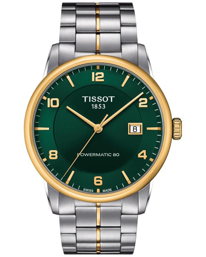
Tissot Men | Luxury

(SKU | T0864072209700)

  • Clean Arabic numerals offer immediate legibility without competing with other dial elements. 
  • Even spacing and modern typographic weight strike a practical, contemporary tone. 
  • The numerals feel confident yet measured, neither too bold nor too delicate. 
  • A reliable example of how numerals can look fresh and functional without appearing clinical. 

View Product

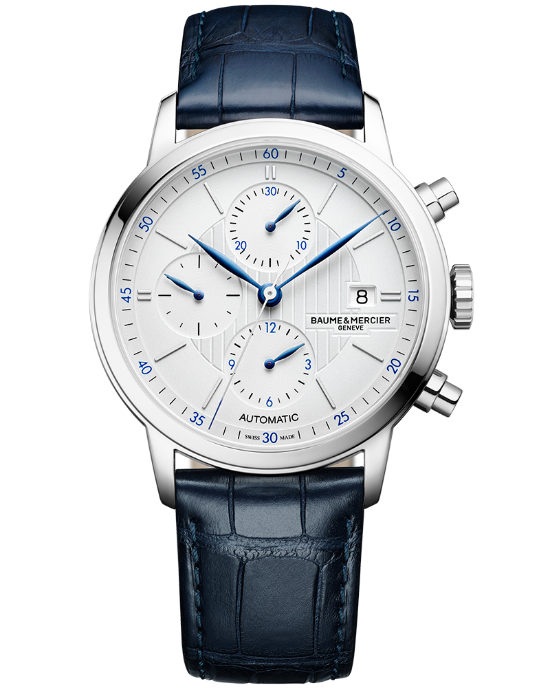
Baume & Mercier Men | Classima Silver

(SKU | BMM0A10330)

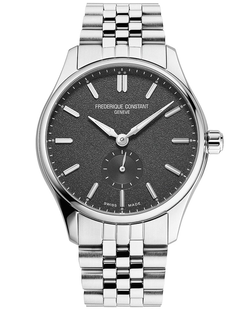
  • The absence of numerals shifts the emphasis to proportion, finishing, and negative space. 
  • Applied batons (markers) introduce depth as they catch and reflect light throughout the day. 
  • The dial maintains a minimal, modern clarity without appearing flat or sterile. 
  • Demonstrates how markers alone can define a sophisticated, contemporary identity rooted in subtlety. 

View Product

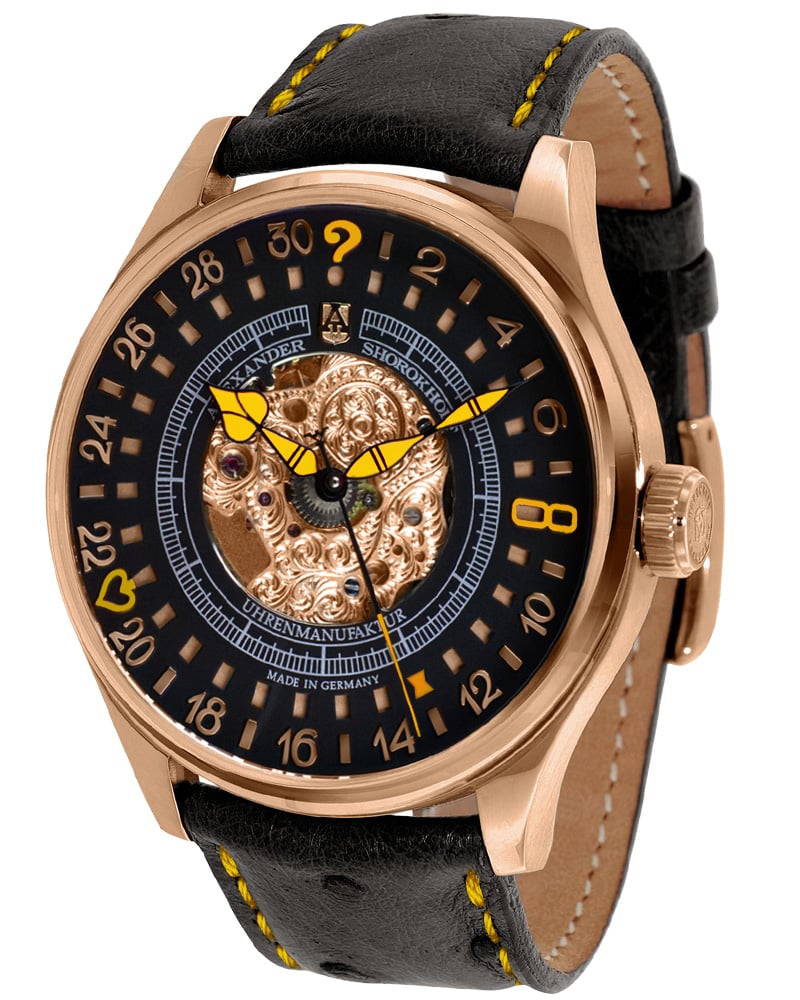
Alexander Shorokhoff Men | Lucky 8-2 Black

(SKU | ASV302-GY)

Expressive oversized numerals 

  • Oversized numerals become sculptural design features rather than simple markers of time. 
  • The avant-garde typography and dramatic layout create energy and motion across the dial. 
  • The bold ‘8’ is functional but also symbolic, lending the watch its unmistakable personality. 
  • A reminder that indices can be expressive, artistic, and characterful, and not merely functional. 

View Product

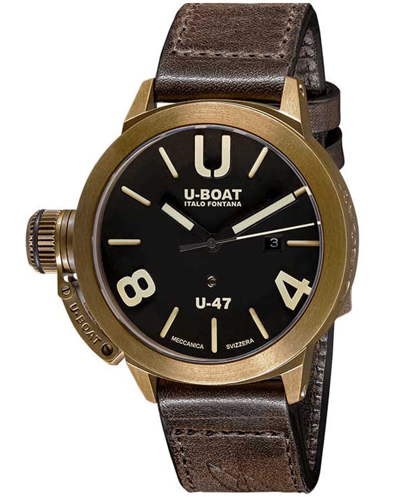
U-Boat Unisex | Classico

(SKU | 7797)

Oversized industrial numerals 

  • Heavy Arabic numerals give the dial a strong, engineered aesthetic, reminiscent of industrial gauges. 
  • The typographic weight amplifies wrist presence and makes the watch feel substantial and purposeful. 
  • Industrial styling reflects a utilitarian design approach, prioritising bold visibility. 
  • Typography here takes on a structural role, shaping the entire identity of the watch. 

View Product

Summary

When you step back, it becomes clear that indices are the language a watch uses to communicate. The right serif, the right stroke weight, the right amount of depth or shine can shift a dial from formal to familiar, from modern to nostalgic, from purely functional to charming. And that’s why collectors obsess over them. Indices tell you where a watch comes from, what era it nods to, and how it intends to be worn. Get the typography right, and the whole design opens up; get it wrong, and even the most impressive movement can feel slightly out of tune. In the end, that’s the joy of studying them: once you notice the details, you can’t unsee them, and the appreciation only grows from there.

FAQs

Indices are the markers (numerals, batons, dots, or applied elements) that indicate hours or minutes on a watch dial.

Yes, the typeface, size, spacing, and construction of indices have a direct impact on how quickly time can be read.

Roman numerals (I,II,III) convey tradition and formality; Arabic numerals (1,2,3) are more modern and functional.

Neither is ‘better’, applied markers offer depth and luxury, while printed indices can suit vintage-inspired or minimalist designs.

Alignment affects the perceived balance of the dial and its connection to historical design codes.Alignment affects the perceived balance of the dial and its connection to historical design codes.

Indirectly, yes. Good design improves desirability, which can enhance long-term appeal.

A precise, evenly spaced minute scale inspired by 19th-century pocket watches used in railway operations.

Quartz vs Mechanical vs Automatic: Choosing the Right Movement
How Dial Finishing Changes the Way a Watch Reads